Superhero style character design for Sustainables Academy by Dylan Gibson.
Read MoreA Tricky Scene
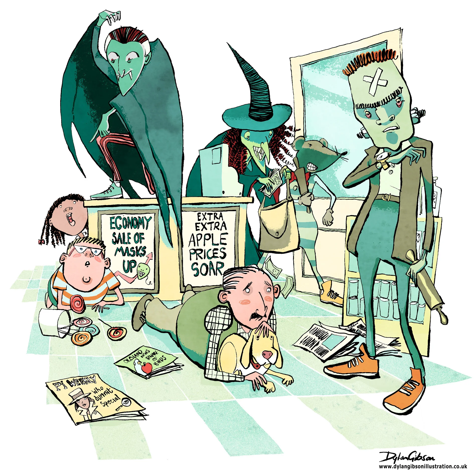
Imagine a robbery at a newsagents and all manner of scary thoughts cross your mind, the potential for someone to get hurt, weapons, dangerous assailants and theft. When illustrating a scene like that in a children’s book you have to step carefully. Even when the tone of the book is funny you have to consider making the scene look dangerous and dramatic without having the illustration look too violent or scary. At the same time you have to give the artwork a little edge as to not belittle how terrifying a robbery can be. Performing a illustrated balancing act worthy of a trapeze artist starts with laying out the essential elements from the story and composing a layout.
Creating a good concept illustration is key to developing the right tone and I’ll do that by taking a very rough sketch and using layout paper just go over it again until I get character, composition and tone the way I want it. Getting it right at this stage means no later disappointment from the publisher by keeping the intention of the approved signed off concept in line with how the finished image will look like.
My Pen and Ink illustration for the Halloween Bandits
For my robbery scene, illustrated in pen and ink, I added in a few bystanders, a man protecting his dog, and a boy next to a jar of lollipops. It really helps of course that my robbers were wearing Halloween masks and that alone helps keep the look fun, dramatic and not too scary.
Illustrating a Book Pt4 Working on the cover
Illustrating the cover shouldn’t be any different from drawing the artwork for the interior but is in many ways. Firstly it’s an important factor in selling the book and has to represent what the story is about inone image, it has to illustrate the tone of the book whether its humorous, dramatic or an adventure story. It needs to convey the genre maybe in an overt way or more subtlety, an example is a fantasy story with magic, monsters and strange lands that needs to be communicated on the cover to the potential reader.
Ways of illustrating this could be to show full on these fantasy elements with more recognisable details becoming secondary. Another approach would be to ground the story showing the more approachable characters more prominently and the fantasy as a backdrop. As an artist there is maybe no right or wrong direction and it is more about responding to the story as a reader and interpreting it as a creative in the way you believe most fits the story. As a freelance illustrator commissioned by an editor or author to create an artwork for the cover it’s a different matter as you will receive a brief or outline for you to interpret. The scope of what you can create will vary from project to project. A tight brief is not a constraint to your imagination rather an opportunity, a creative response can be just as effective while working within set boundaries.
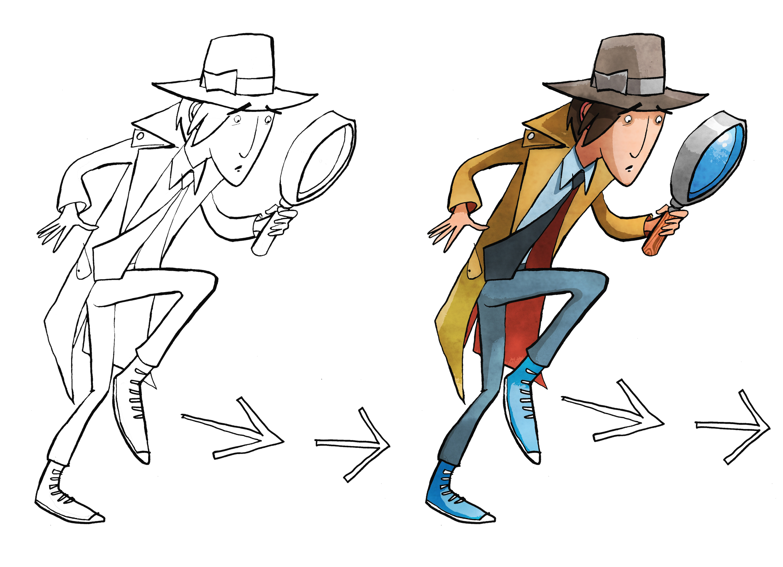
Cover Illustration rough and finished artwork for dropping into design. Pen and ink using art pens, dip pen and brush. Illustration coloured on PhotoShop.
The book cover illustration for The White Arrow Assassin by Tim Flanagan was a rather simple brief to show the main character Private Investigator Lawrence Pinkley. The character illustration was to be set on a coloured background with title and not include location or any scene from the book. Visually there are a few ways that you can sell what he does on the front cover in a quick and effective way. If you were to do word association with the description of detective a number of stereotypical answers about look and props would come your direction. Using iconic imagery was key to sell the idea to audiences quickly. As Pinkley’s look is typical of old gum shoe and noir detectives and his age is set down in the story, the boundaries are there to work within and the key challenge is representing by understanding his character in a quirky way. He’s still new to the profession and out of his depth the humour in the story comes from his not understanding and inferring incorrectly from clues, resulting in the wrong deduction. So when creating his character, a little bit of awkwardness in his physicality and stance goes some way in conveying this in the illustration.


