Important Stories

Want to tell a story that truly matters? Harness the power of visual storytelling—where words and imagery combine to leave a lasting impact.

This is the story of Isi Metzstein, a young boy who escaped pre-war Berlin on the Kindertransport and found refuge in Glasgow. Told through Isi’s own voice, drawn from an intimate audio interview, the narrative reveals the danger he faced, the heartbreaking separation from his family, and their miraculous reunion as they built a new life in Scotland.

The story was brought to life through a powerful collaboration between writer Paul Bristow, myself, and the young people of St Bride’s School. The resulting comic is a moving testament to how learners and creators can work together to illuminate history—preserving voices that must never be forgotten.

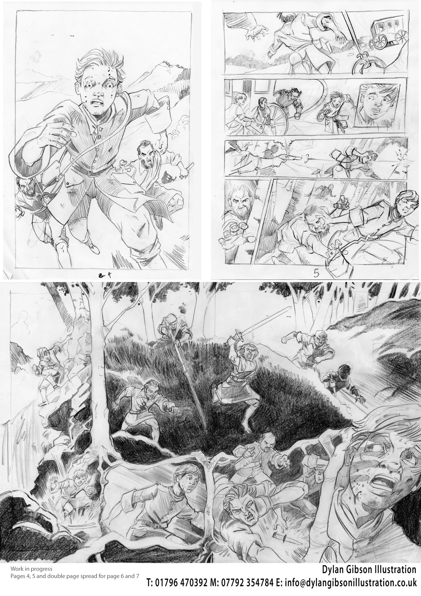
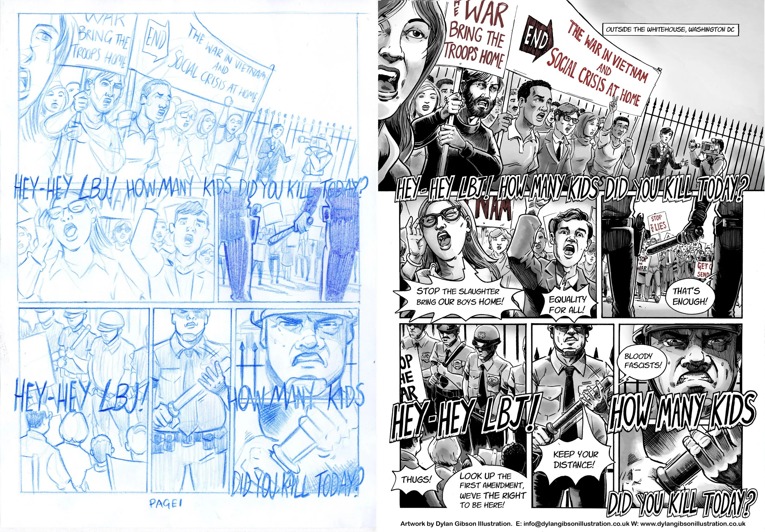
All the illustrations were created in pen and ink, hand drawn and the artwork scanned and coloured on Photoshop. Have a look at the short video to see all the pages in Isi’s story. The idea from the leaners was to have the fire punctuate the black and white to show the violence of the fire that destroys his Synagogue,

Comic book layouts

Creating those first marks on a page is always an exciting time. Taking a story and visualising the characters telling an exciting tale is really a joy. This is my first draft at a new story, a Jacobite period tale of excitement and running! My inspiration to open the story was to have the main character running for his life, from this we flash back into what led him to this life threatening moment.

Creating Graphic Novel Artwork

Telling a captivating story with pictures is a love of mine and I’m always thrilled when I get a commission to create illustrations for a new visual narrative. The draft and finished page below has been taken from Goliath a story set in 1967 and the year 2000.

As much as I hate to admit it the year 2000 is now firmly in the past and this novel is essentially two period pieces within one story! So the look of both times needs researched and delving into the past to get the look and feel right can be it’s own time consuming rabbit hole if you let it. You get an immediate satisfaction if you get it right. I think the trick is not to pick out too many obvious examples from the period as this especially in the case of fashions can make the feel characteristic.

First I start by reading the story, I let it percolate a bit in my mind and play it out in my imagination like a film, thinking composition, point of view and pacing. I try to trust my intuition and find that if it feels easy to draft down on the page then I’m doing it right. After I might go back into it and do a little refinement before illustrating the final page.

I still draft my rough pages by hand and you can see I have a love for using colour pencils. This draft stays very close to the final page, you will see a little refinement here and there only. The finished art is hand drawn in pen & ink then scanned. I use a layer with textured paper to help soften the shade I add to give it a wash, water coloured feel which I think helps adds to the period look.

I used greyscale with some colour to highlight elements for the 1967 time period and used colour for the year 2000 parts of the story so the reader knows when exactly they are at a glance.

Goliath. Draft page and Finished art comparison. All my illustrations are hand rendered in pen and ink.

WOOF!

Illustration Friday this week is all about the nose so to sniff around for a little exposure and have some fun I’ve submitted this fellow, my Basset Hound illustration.  Having a little play with perspective to show the head a little closer and focus on the expression gives shows this pooch’s personality more and makes the illustration quirky. 

As a freelance illustrator I’m commission to draw a wide variety of places, people and animals and my work includes advertising illustrations, editorial illustrations, educational illustrations, narrative artwork for children’s books and picture book illustrations.  Having quick visualization skills I’m also asked to illustrate storyboards and commissioned to illustrate character designs and pitch artworks.

Pencil illustration, coloured up and layered on PhotoShop

Pencil illustration, coloured up and layered on PhotoShop

Hopefully I’m not barking up the wrong tree to say that you’ll find my dog illustration as lovable as I do. Waggy tails all round.

To submit an artwork please go to Illustration Friday

Illustration Friday

Illustration Friday http://illustrationfriday.com/ run a fun weekly challenge to create or submit an illustration based on a weekly subject. The topic ranges widely and its fun to come up with an illustration and get it out there. I'll post my weekly entry on this site and drop by to have a look to see what I've come up with. 

This week's topic is Tattoos.  This is my pen and ink illustration done quickly in felt pen with some bright colours added on PhotoShop, use your shades when viewing!